In 2025, AI platforms are essential for marketers and decision-makers who need rapid insights without deep programming knowledge.
AI data visualization tools are advanced software platforms that combine artificial intelligence with data analytics to automatically generate charts, graphs, and dashboards. These tools interpret complex datasets, suggest optimal visualization formats, and often support natural language queries, making analytics more accessible for non-technical users.
How do leading businesses turn vast amounts of raw data into clear, actionable insights—almost instantly?
Here are the most valuable AI Data Visualization Tools available on the market today.
Comparison of Best AI Tools for Data Visualization
The landscape of AI tools for data visualization continues to evolve with sharper focus on automation, real-time analytics, and usability. Below is a detailed evaluation of the top-performing platforms in 2025.
Julius AI
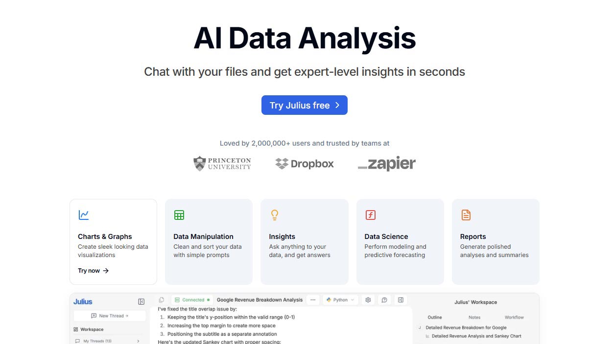
Julius AI is an AI-native data visualization tool tailored for business analytics and executive decision-making. It converts natural language prompts into dynamic charts and dashboards with speed and precision.
Strengths: Fast NLP chart generation, business-focused logic, efficient handling of large datasets.
Ideal Use Case: Executives and analysts needing quick, interpretable visuals for strategic decisions.
Pricing: Starts at $29/month. Free trial available.
Link: https://www.julius.ai
ThoughtSpot
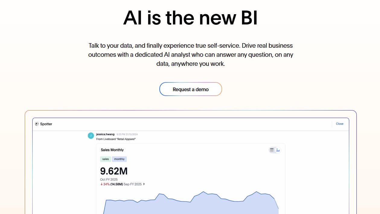
ThoughtSpot is a powerful AI analytics tool that delivers search-driven insights with NLP-based query input, enabling users to uncover real-time trends without writing code. Its AI modules optimize performance across large-scale enterprise environments.
Strengths: Intuitive natural language search, AI-generated dashboards, enterprise-level scalability.
Ideal Use Case: Enterprise teams requiring quick self-service analytics from complex datasets.
Pricing: Starts at $95/user/month. Custom pricing for enterprise packages.
Link: https://www.thoughtspot.com
Zoho Analytics
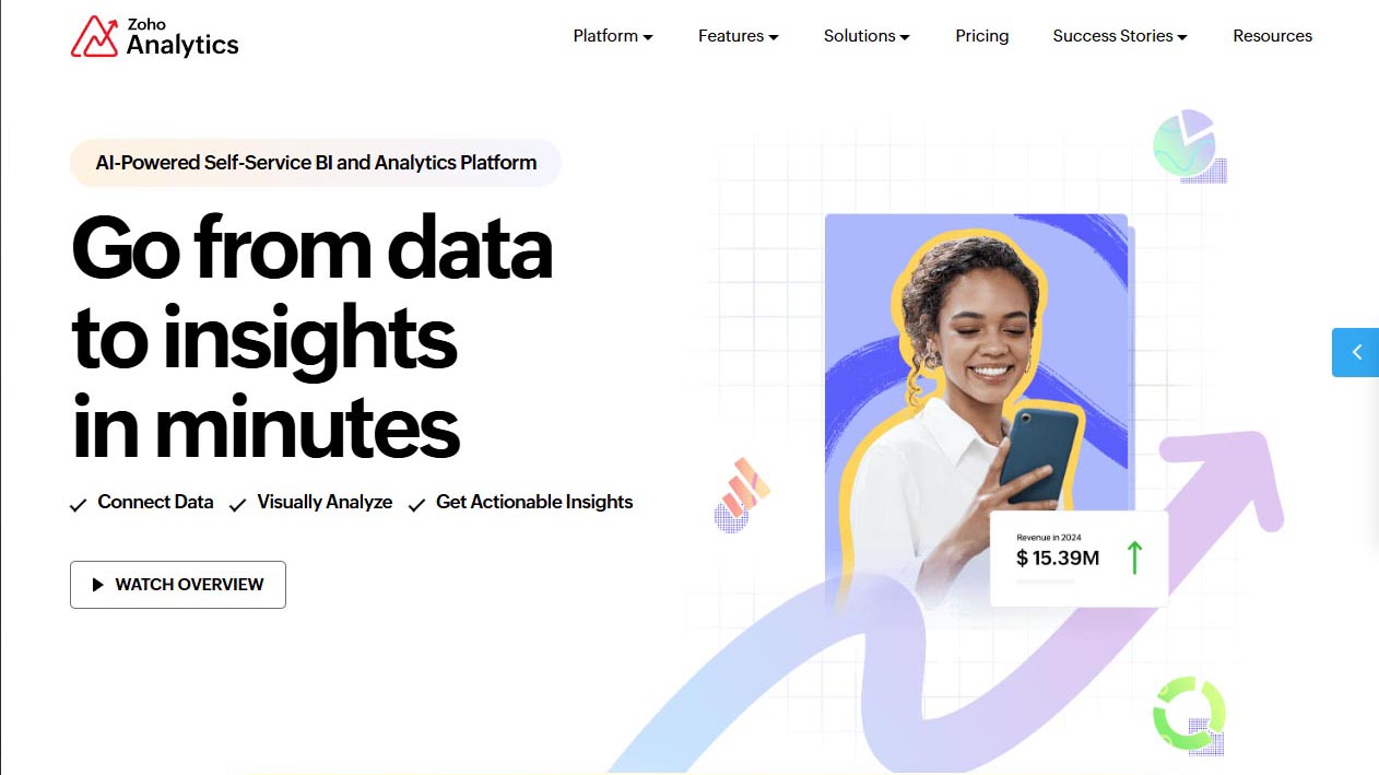
Zoho Analytics is an AI-powered BI tool that combines ease of use with advanced reporting features. Its virtual assistant “Zia” helps users ask questions and receive data visualizations instantly.
Strengths: Built-in AI assistant, broad integration, accessible for SMEs and enterprises.
Ideal Use Case: Marketing, sales, and operations teams building recurring reports and predictive dashboards.
Pricing: From $30/month for two users. Free plan available with limited features.
Link: https://www.zoho.com/analytics
Domo
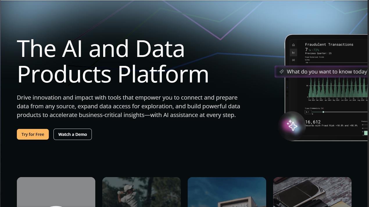
Domo is a cloud-native business intelligence tool with built-in AI models and a unified data fabric. It excels at scaling analytics across departments, combining ETL, visualization, and AI in one interface.
Strengths: Scalable infrastructure, mobile-first design, strong predictive analytics.
Ideal Use Case: Mid to large enterprises managing multi-source data and predictive workflows.
Pricing: Custom enterprise pricing. Demo required for detailed quote.
Link: https://www.domo.com
Datapad
Datapad is a mobile-first AI dashboard tool offering real-time metric tracking and team collaboration. Its intuitive UI enables non-technical users to build and monitor dashboards directly from mobile devices.
Strengths: Lightweight, mobile-optimized dashboards, real-time alerts, easy syncing.
Ideal Use Case: Startups and growth teams needing agile KPI monitoring on the go.
Pricing: Free plan available. Pro starts at $15/month.
Link: https://www.datapad.io
Plotly
Plotly is a developer-centric visualization tool supporting languages like Python, R, and MATLAB. It enables the creation of highly customizable, interactive, and 3D-capable visualizations for advanced analytical needs.
Strengths: Developer flexibility, support for multiple languages, integration with scientific tools.
Ideal Use Case: Data scientists and engineers building complex, interactive visuals in custom apps.
Pricing: Open-source version available. Commercial license starts at $2,000/year.
Link: https://plotly.com
Google Charts
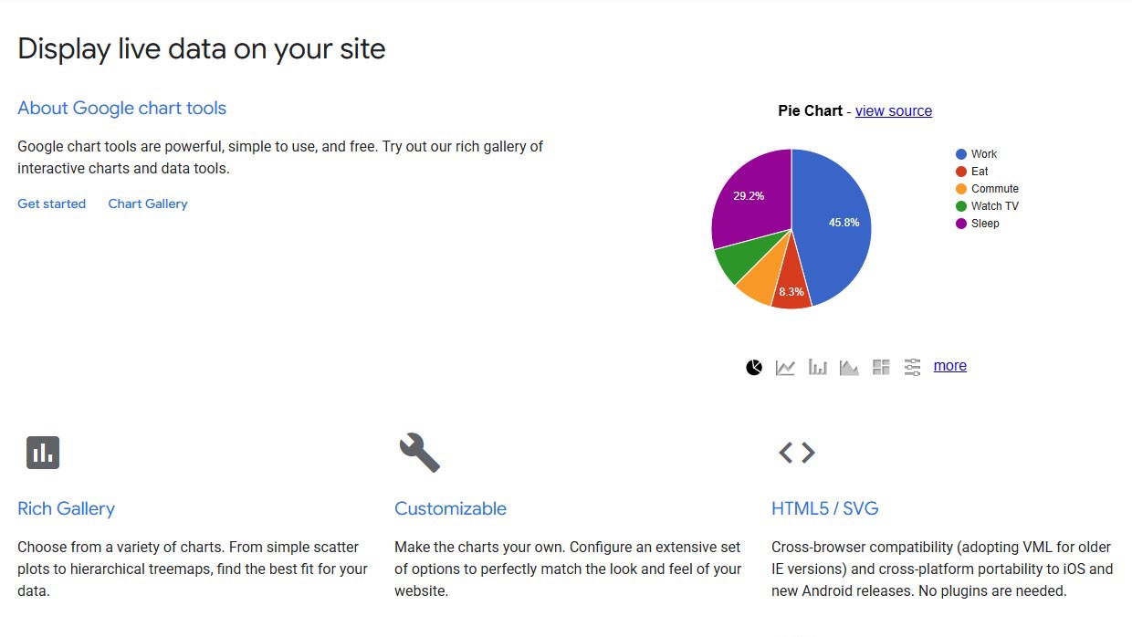
Google Charts is a free web-based tool offering responsive, embeddable charts suitable for simple data visualization needs. It integrates easily with other Google services and websites.
Strengths: Lightweight, browser-native visualizations, no cost, API access.
Ideal Use Case: Web developers and small businesses needing fast, clear visuals for dashboards or apps.
Pricing: Free.
Link: https://developers.google.com/chart
Tableau
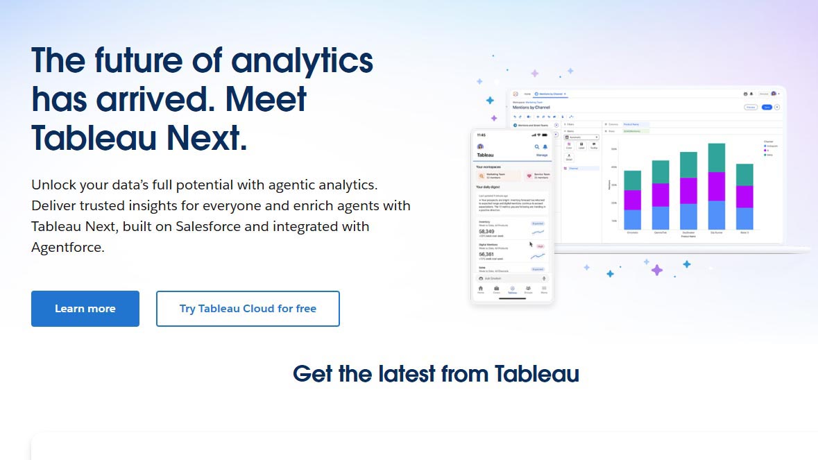
Tableau is a leading enterprise data visualization tool offering AI-driven insights, real-time data connections, and interactive dashboards with drag-and-drop functionality.
Strengths: Advanced analytics, live data connections, AI-powered recommendations.
Ideal Use Case: Data analysts and BI teams seeking detailed, scalable, enterprise-grade visualizations.
Pricing: Starts at $70/user/month for Tableau Creator.
Link: https://www.tableau.com
Infogram
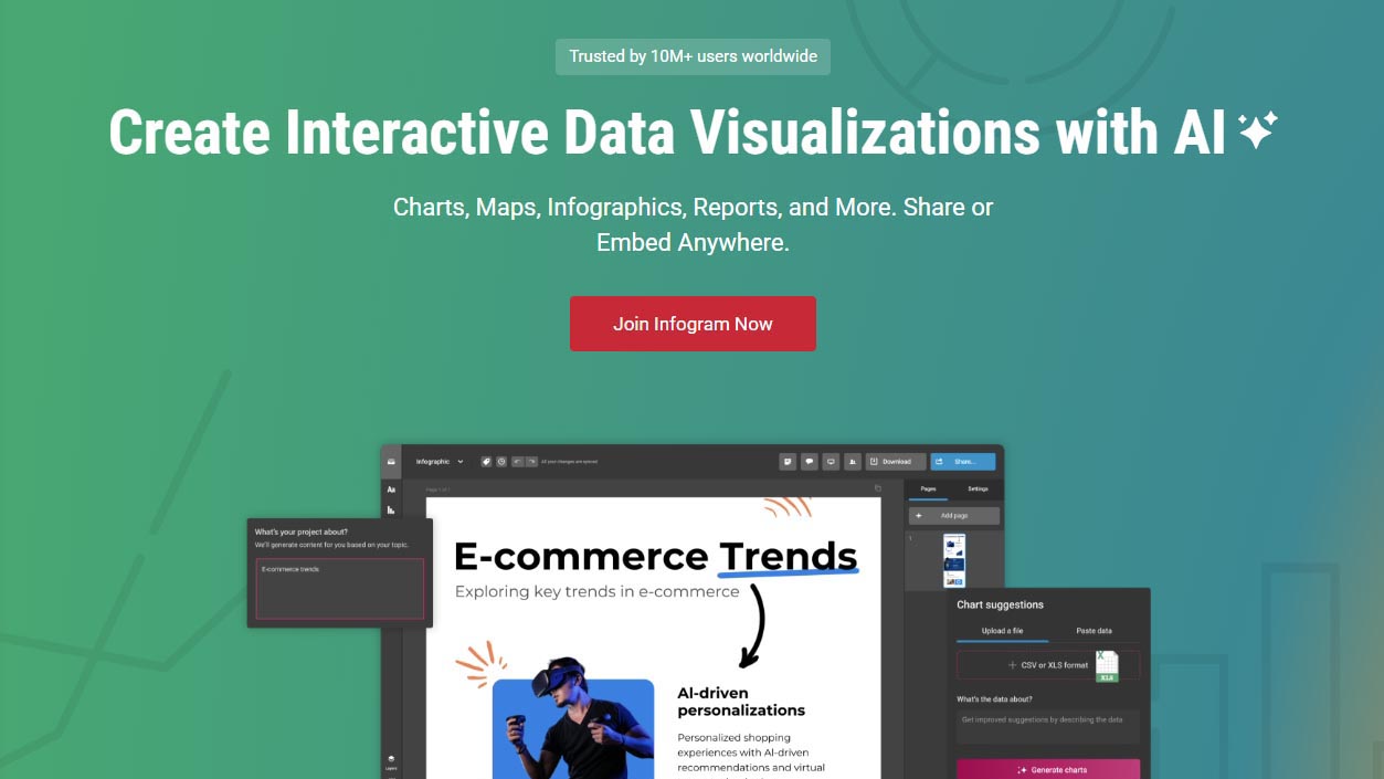
Infogram is an easy-to-use AI visualization tool that generates charts and infographics using AI-assisted templates. It’s built for quick turnaround times with minimal design input.
Strengths: Fast infographic creation, drag-and-drop interface, strong branding features.
Ideal Use Case: Marketing teams, content creators, and PR professionals under deadline pressure.
Pricing: Freemium available. Pro plans start at $25/month.
Link: https://infogram.com
Sisense
Sisense is an AI-powered analytics tool that combines customizable dashboards with conversational analytics, allowing users to query data using voice or text. It supports embedded analytics and collaboration across enterprise teams.
Strengths: Voice/text query interface, powerful embedding options, collaborative tools.
Ideal Use Case: Cross-functional business units needing integrated, voice-assisted analytics.
Pricing: Custom enterprise pricing. Demo required.
Link: https://www.sisense.com
Comparison Table of All AI Tools
| Tool | Best For | AI Features | Pricing | Key Limitation |
| Julius AI | Business decision-makers | NLP charting, fast analytics | From $29/month | Limited integration support |
| ThoughtSpot | Enterprise teams | NLP search, real-time dashboards | From $95/user/month | Higher learning curve |
| Zoho Analytics | SMEs and cross-platform reports | AI assistant “Zia”, predictive analytics | From $30/month | Limited real-time processing |
| Domo | Large-scale operations | ML modules, mobile-first BI | Custom pricing | Complex setup, opaque pricing |
| Datapad | Mobile teams | Trend alerts, simplified dashboards | Free or $15/month | Limited desktop functionality |
| Plotly | Developers | Custom visuals, 3D charts, API integration | Open source | Technical expertise required |
| Google Charts | Web-based reports | Lightweight, browser-native rendering | Free | Basic functionality only |
| Tableau | Enterprise analysts | AI-driven insights, live data updates | From $70/user/month | Higher cost for full feature set |
| Infogram | Marketing visuals | Text-to-infographic generation | Freemium | Not ideal for complex datasets |
| Sisense | Cross-functional collaboration | Conversational analytics, data modeling | Custom pricing | Requires technical onboarding |
How AI Enhances Data Analytics Workflows

AI tools are reshaping data analytics workflows by simplifying routine tasks, enabling large-scale data handling, and customizing insights for different user roles. Within today’s visualization platforms, each AI tool acts as both engine and guide—rapidly converting raw datasets into actionable intelligence. For marketers and business strategists, this reduces reliance on technical teams while unlocking deeper visibility into campaign performance, customer behavior, and operational efficiency.
From raw data to smart dashboards
AI tools drastically reduce the time from data ingestion to visualization. Traditional processes that once consumed hours are now accelerated through automation. Key capabilities include:
- Data preparation automation: Tools like Qlik AutoML and Tableau Prep Builder use machine learning to clean, join, and classify data automatically.
- Anomaly detection: AI highlights irregularities and outliers early in the process to ensure cleaner inputs.
- Chart recommendations: Once data is structured, AI suggests the most relevant visual formats based on content and user context.
This process enables real-time insight generation—especially valuable in fast-paced marketing environments where performance data must be analyzed and acted on quickly.
Reducing cognitive load in decision-making
AI visualizations simplify interpretation by focusing attention on what matters most. Instead of requiring users to comb through complex dashboards, AI surfaces high-impact insights through:
- Natural language generation: Tools like Power BI’s Smart Narratives convert data into plain-language summaries.
- Statistical filtering: ThoughtSpot’s SpotIQ applies significance testing to highlight meaningful trends.
- Contextual relevance: Outputs are tailored to the user’s goals, ensuring insights align with strategic intent.
For marketers, this often results in quicker identification of underperforming audience segments or emerging trends that warrant immediate action.
Embedded AI for continuous optimization
Modern analytics platforms are moving beyond static reporting toward adaptive, behavior-aware dashboards. Embedded AI tools enable ongoing optimization by:
- Tracking user interactions: Machine learning monitors filter use, drilldowns, and navigation patterns.
- Dynamic customization: Dashboards evolve based on usage, surfacing the most relevant KPIs and views.
- Proactive recommendations: Platforms like Sisense and Domo suggest new visualizations or data relationships as business conditions shift.
This continuous learning loop ensures that insights remain timely and aligned with operational objectives, reducing lag between observation and action.
Future of AI Tools in Data Visualization and Analytics

The next phase of AI-driven data visualization is defined by automation, interactivity, and cross-modal intelligence. As generative and multimodal AI mature, businesses will see analytics platforms evolve into interactive assistants capable of interpreting complex datasets and presenting insights through diverse media. These innovations aim to democratize analytics further, remove friction from insight discovery, and reinforce ethical data practices.
Generative AI and adaptive charting
Generative AI is reshaping how dashboards are created and consumed. Emerging tools like Power BI Copilot and Salesforce’s Einstein GPT are leveraging large language models to translate plain-text prompts into dynamic visualizations, tailored narratives, or even full executive summaries. These systems consider audience, intent, and context to build responsive charts that evolve in real time. This adaptive charting capability may redefine how marketing teams present data to executives, replacing traditional slides with AI-curated, story-driven visuals that update automatically. Here is our list of the best ai automation tools for business.
Multimodal data visualization with AI
Future-ready AI tools are beginning to support multimodal data interpretation, enabling insights from voice, image, and video inputs. This evolution expands the analytical scope and usability of visualization platforms across departments. Key developments include:
- Voice-to-dashboard functionality: AI models may soon convert verbal commands into live dashboards, streamlining access for non-technical users.
- Image and video analysis: Tools will be capable of analyzing brand assets such as ad creatives, product visuals, or campaign videos alongside performance metrics.
- Integrated computer vision and speech recognition: These capabilities enhance data context by combining structured KPIs with unstructured media signals.
- Holistic campaign evaluation: Marketers can compare engagement metrics with visual and audio content quality for a more comprehensive view of campaign impact.
This convergence is expected to become standard in tools supporting creative teams and digital-first enterprises.
Ethical AI and data governance
With greater automation comes increased responsibility. Ethical AI in data visualization involves transparency, bias mitigation, and adherence to data governance standards like GDPR and CCPA. Leading tools now embed explainability features, audit trails, and consent management into their pipelines. For example, IBM Cognos Analytics offers model interpretability layers, while Google Cloud includes fairness metrics in its Vertex AI platform. Businesses must ensure that visual insights are derived from representative, validated datasets and that recommendations do not unintentionally amplify systemic biases—especially in high-stakes domains such as finance, healthcare, and policy marketing.
Frequently Aksed Quetions
Google Charts remains one of the most accessible and flexible free AI-supported tools for basic visualization needs. It’s ideal for small businesses and developers due to its cost-free structure, responsive charts, and seamless integration with other Google services. For more AI-enhanced capabilities, Zoho Analytics and Datapad offer free plans with smart assistants and mobile-optimized dashboards, providing entry points into AI-powered analytics at no cost.
ThoughtSpot stands out as the top AI tool for enterprise-level data visualization. Its search-driven analytics and natural language processing engine make it easy to query large datasets without technical knowledge. For executives seeking real-time visuals from conversational prompts, Julius AI offers business-focused logic and rapid chart generation, making it ideal for strategic insights. Meanwhile, Tableau continues to lead among enterprise BI platforms with its AI-driven Explain Data and Einstein Discovery features.
Yes. AI automates the entire data visualization pipeline, from data preparation and anomaly detection to chart generation and insight narration. Tools like Julius AI, ThoughtSpot, and Zoho Analytics use natural language processing and machine learning to convert raw data into interactive, dynamic visuals—often without writing a single line of code. AI enhances not only the speed but also the precision of visual insights.
Julius AI is one of the best AI-native visualizers for professionals seeking instant, business-relevant dashboards from natural language input. It focuses on high-speed generation and clarity, tailored for executive decision-making. For broader enterprise use, ThoughtSpot remains unmatched in its ability to deliver AI-generated dashboards at scale, with strong support for real-time query interpretation.
Tableau continues to be the most widely used platform globally, favored by data analysts and enterprise teams for its comprehensive feature set, intuitive interface, and expanding AI capabilities. It supports live data connections, predictive insights, and drag-and-drop design, making it the preferred tool for organizations requiring detailed, scalable data visualizations.
